

Campaign Dashboard
The Campaign & Line Item Dashboard is your central hub for tracking and analyzing campaign performance in Commerce Max. Whether you're reviewing results at the campaign level or drilling down into specific line items, these dashboards help you monitor key metrics, identify trends, and make informed optimization decisions.
From high-level summaries to granular data, you’ll have the tools you need to evaluate performance, compare KPIs, and uncover insights that support your campaign goals, all from one place.
What is Campaign Dashboard?
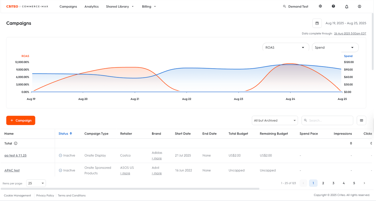
The Campaign Dashboard is the first thing you see when logging in to your Commerce Max account. It is the landing page of the Campaigns section.
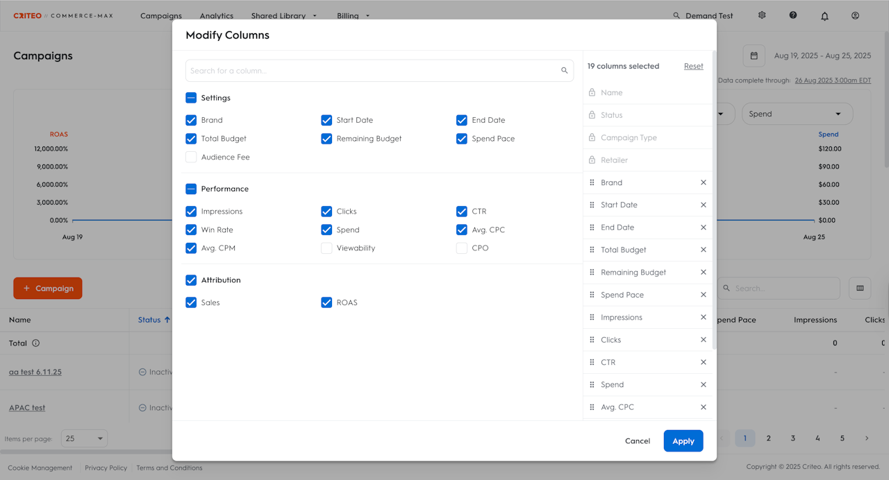
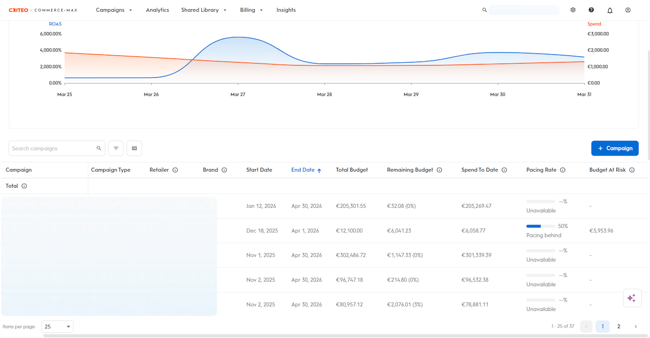
The dashboard provides a high-level snapshot of your performance through a combination of visual graphs and detailed tables, giving you a quick and clear understanding of key trends. It also allows you to customize your analysis by selecting the specific metrics you want to view in the performance graph, such as:
Settings
Retailer
Brand
Start Date
End Date
Total Budget
Remaining Budget
Bid
Spend To Date
Audience Fee (for Offsite)
Buying Strategy (for Offsite)
Optimization (for Offsite)
Spend Pace (for Offsite)
Performance
Pacing Rate (for Onsite Display and Offsite)
Budget At Risk (for Onsite Display and Offsite)
Impressions
Clicks
CTR
Win Rate
Spend
Avg. CPC
Avg. CPM
Viewability
CPO (for Offsite)
Attribution
Assisted Sales
Sales
ROAS
Click the button next to the search bar to customize and select the KPIs you want to analyze. This allows you to have a deeper look at the campaigns you are most interested in, and it will become your default view each time you log in to the platform.
Additionally, from the Campaigns dashboard, you can navigate to the following pages as well:
Analytics
Shared Library
Audiences and Segments
Creatives
Domain/ App Lists
Billing
Balances
Credits
For more details on your campaign’s performance, you can drill into individual line items in the Line items Dashboard, or access detailed reports in the Analytics Section of the UI.

Line Items Dashboard
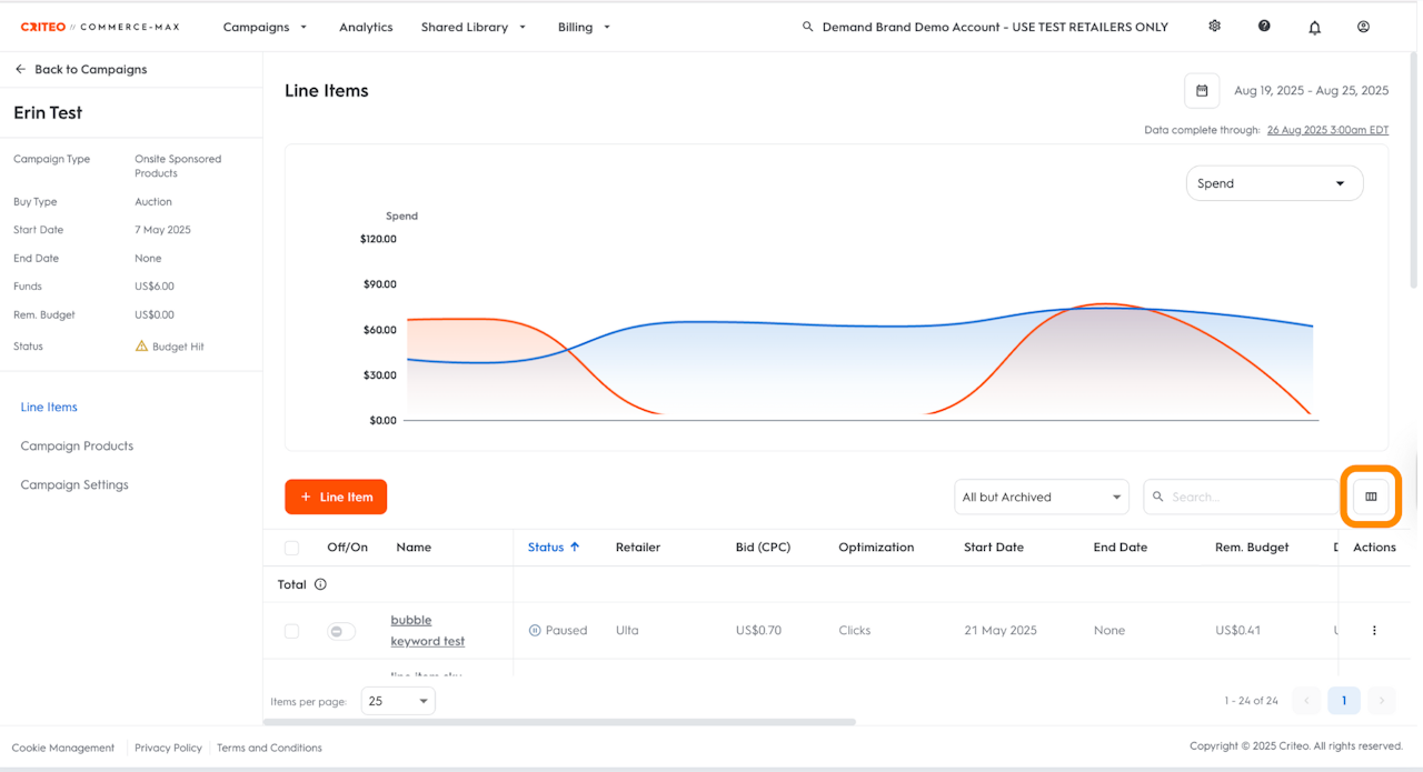
For a more in-depth analysis, you have two choices – Line Items Dashboard and Analytics Tab. You can click on a campaign, which will bring you to the Line Items Dashboard.
The dashboard provides a high-level snapshot of your performance through a combination of visual graphs and detailed tables, giving you a quick and clear understanding of key trends. It also allows you to customize your analysis by selecting the specific metrics you want to view in the performance graph, such as:
Settings
Retailer
Brand
Start Date
End Date
Total Budget
Remaining Budget
Bid
Spend To Date
Audience Fee (for Offsite)
Buying Strategy (for Offsite)
Optimization (for Offsite)
Spend Pace (for Offsite)
Performance
Pacing Rate (for Onsite Display and Offsite)
Budget At Risk (for Onsite Display and Offsite)
Impressions
Clicks
CTR
Win Rate
Spend
Avg. CPC
Avg. CPM
Viewability
CPO (for Offsite)
Attribution
Assisted Sales
Sales
ROAS
Video (for Onsite Display and Offsite)
Completion Rate
Video Views
Starts
Played to 25%
Played to 50%
Played to 75%
Played to 100%
Playing Rate
Starting Rate
Video Viewability
Video Paused
Video Resumed
Video Muted
Video Unmuted
Average Interaction Rate
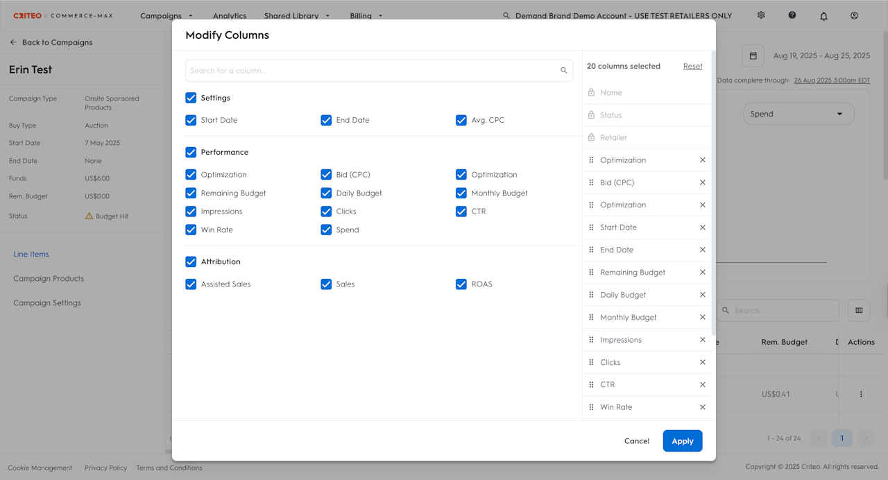
Click the button next to the search bar to customize and select the KPIs you want to analyze.
This allows you to have a deeper look at the campaigns you are most interested in. Once accepted, this will become the default view each time you log in.
Analytics
You can also go to the Analytics section of the UI, where you’ll find performance broken down by Campaign, Line Item, Product Brand, Product Category, Product, Page Type or Keyword etc. For more information, click here.

Why are these dashboards useful?
You can visualize the data in the graph with up to two metrics simultaneously. This can help you visualize the relationship between the selected metrics and identify the root cause of any performance change.
For example:
Your Spend dropped yesterday.
Select Spend as metric number 1 in the graph, and then try Clicks as metric number 2.
Did the clicks drop yesterday as well? If so, you can relate the Spend drop to fewer clicks.If not, then change metric number 2 to CPC. For example, did the CPC change yesterday? If it’s been lowered, then that can explain your decrease in Spend.
Your ROAS increased yesterday.
Select ROAS as metric number 1 and then select CPC as metric number 2. You can see that your CPC decreased yesterday, and that might explain why your ROAS increased.
Campaign Dashboard KPIs:
You can choose from 18 settings and KPIs available for selection in the Campaign Dashboard:
Brand, budget, ROAS, clicks, average CPC, average CPM, CTR, impressions, sales, spend, remaining budget, spend pace, win rate, viewability, CPO, and start & end dates.
By default, you will see ROAS in the first dropdown and Spend in the second one on top of the interactive graph. These can be changed at any time.
Line Items Dashboard KPIs:
You can choose from 17 settings and KPIs available for selection in the Line Items Dashboard:
Optimization, Win Rate, Assisted Sales, budget, bid, ROAS, clicks, average CPC, average CPM, CTR, impressions, sales, spend, and dates.
By default, you will see Spend in the first dropdown on top of the interactive graph.

Using the Tooltip
The dashboard tooltip shows the data of the two selected metrics for a specific date.
To see the tooltip, simply move your cursor in the graph to the date you’re interested in seeing in detail.
Using the table
In the table, you can search for a specific campaign or filter by status, and watch the line chart data refresh to reflect these selections.
Using this table, you can see metrics at the individual campaign level.
Who is this for?
It is accessible to all users to track and optimize campaign performance in Commerce Max.
When to use it?
Use the Campaign & Line Item Dashboards when you want to:
Get a quick performance overview across all your campaigns and line items.
Analyze trends such as changes in spend, clicks, ROAS, or impressions over time.
Compare multiple metrics (like ROAS vs. CPC) to investigate performance changes.
Drill down into specific campaigns or line items to identify what’s working and what needs improvement.
Validate the impact of recent changes, such as bid adjustments or budget updates.
Identify underperforming areas before they impact overall results.
This feature is especially helpful for day-to-day performance checks and for making data-driven decisions to optimize your campaigns.

